When new owners Nick and Rachel took over a struggling fitness center their first move was to totally rebrand the business, name and all!
The new name was a nod to the geographic location of Otsego, MN nestled among the Elk, Mississippi and Crow rivers just northwest of Minneapolis. It also presented the opportunity for a fresh, new approach to fitness center branding; one that reflected the surrounding natural environment, resonated with the greater community and welcomed fitness seekers of all ages and backgrounds. (This project also included a website reinforcing the river motif. The clients have since revised the site, adopting a more mainstream fitness center look and feel.)
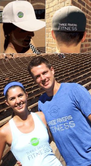
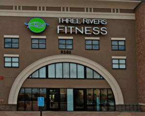
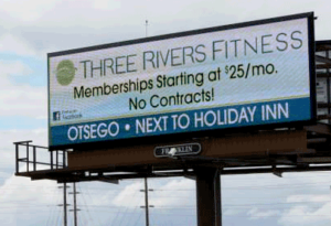
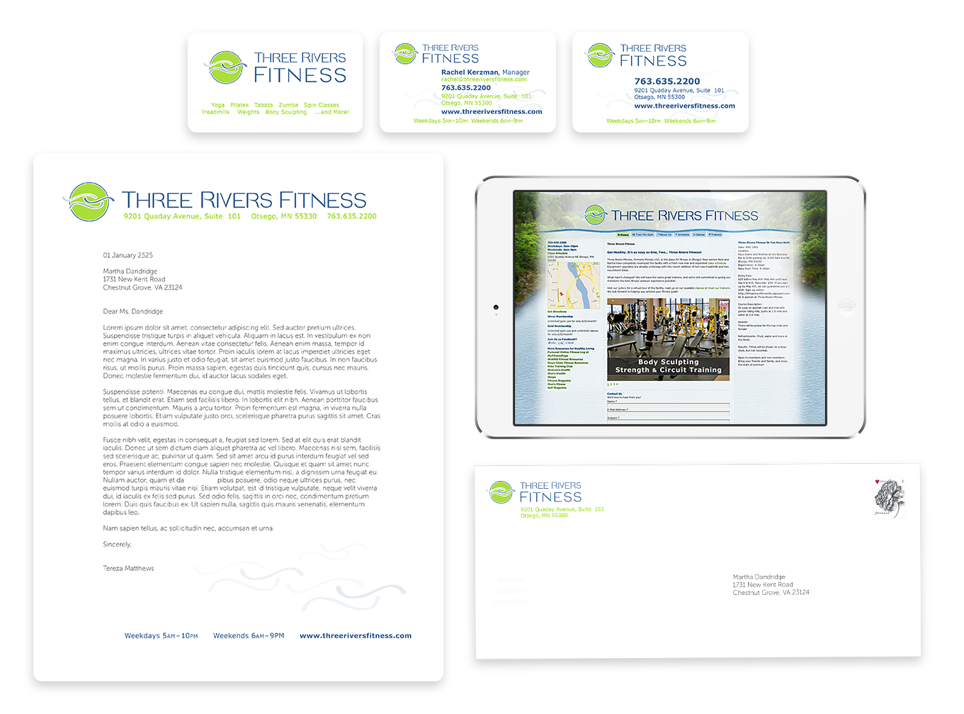
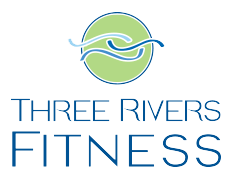
Typography was kept simple and classic. Easy to read, but with a few quirks thrown in for a distinctive twist. Three separate combinations of the logo and word mark pairing provide maximum flexibility for use in branding everything from print and online marketing materials to apparel to outdoor or event signage.
Final brand elements included an interlocking wave pattern to convey motion and fluidity (flexibility) set against a circle of continuity. These graphical elements are used as stand alone identity marks and in conjunction with a word mark.
library of visual identity elements

applied branding